Your views usually rise or fall in the first 3 seconds, because TikTok editing now rewards immediate hook design, quick cuts, and captions that make sense even when the sound is off, according to TikTok-focused editing guidance and platform tutorials MySocial Buffer. That means the difference between a clip that gets swiped away and one that keeps playing is often not the idea, it's the edit. Strong TikTok editing is less about polishing every frame and more about controlling attention with pace, sound, text, and visual clarity.
A lot of creators still edit like they're making a mini film. That approach usually lingers too long, hides the point, and buries the payoff. TikTok rewards the opposite, a clean setup, a fast hook, and a structure that makes the next second feel necessary.
The practical shift is simple, but it changes everything. Build for mobile, cut for retention, and assume your audience is deciding almost instantly whether your video deserves a full watch. If the opening frame doesn't earn the next beat, the rest of the edit won't matter.
Table of Contents
- 1. Quick Cuts & Transitions for Pacing
- 2. Text Overlays & On-Screen Graphics
- 3. Sound Design & Music Sync
- 3. Sound Design & Music Sync
- 5. Trend Adaptation & Format Hooks
- 5. Trend Adaptation & Format Hooks
- 7. Attention-Grabbing Thumbnails & Previews
- 8. Visual Effects (VFX) & Transition Stacking
- 8. Visual Effects (VFX) & Transition Stacking
- 8-Point TikTok Video Editing Tips Comparison
- From DIY Edits to Professional Polish
1. Quick Cuts & Transitions for Pacing
A hard cut on a motion beat is one of the cleanest ways to control pacing in TikTok editing. Cut as a hand lands, a head turn finishes, or a sentence snaps into its point, and the video feels sharper without needing extra effects. The goal is not constant motion for its own sake, it is to remove the dead space that makes viewers drift.
Cut for motion, not just for length
The strongest pacing comes from editing where movement already exists. A head turn, a gesture, a product lift, or the end of a spoken phrase gives you a clean place to jump to the next shot. That kind of cut hides the edit inside the action, which keeps the viewer focused on the content instead of the transition itself.
J-cuts and L-cuts work for the same reason. Let the audio begin before the image changes, or let the image change before the audio finishes, and the sequence feels deliberate instead of chopped up. For creators who want a concrete reference, a practical jump cut example is available here.
Practical rule: if you notice the cut in the timeline, the viewer will usually notice it on the phone.
Short-form videos that move well usually follow a simple pattern. The first shot sets the premise, the next shot removes hesitation, and the next shot delivers the payoff. That rhythm works across dance clips, tutorials, and reaction edits because each frame has a job, not just a runtime.
Pacing also connects directly to captions. If the text is helping the viewer track the point, you can cut faster without losing clarity. If you need help with that layer, learn to write better TikTok captions so the edit and the on-screen message support each other instead of competing.
A good cut is invisible when it should be, and obvious when it needs to create energy. That trade-off matters. Overediting can make a clip feel frantic, but underediting leaves too much empty air, and empty air is where attention drops.
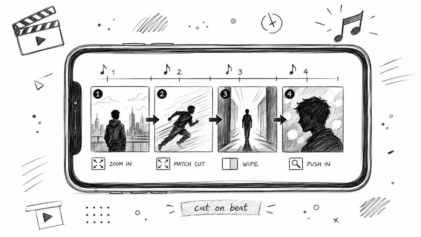
Use transitions only when they solve a pacing problem. A whip pan, zoom, or match cut can connect two ideas cleanly, but if the shot already has a natural motion bridge, a plain cut usually performs better. That keeps the edit fast, direct, and easier to follow on a small screen.
2. Text Overlays & On-Screen Graphics
Text on TikTok has two clear jobs. It explains the point fast, and it keeps the video understandable when sound is off. Editing guides for the platform treat captions as standard practice because a large share of viewers decide whether to keep watching before they ever turn the audio on MySocial NemoVideo. If the message only lives in the voice track, the edit loses reach the moment the room gets noisy or the viewer scrolls without sound.
Put the point on screen before the viewer asks for it
The strongest overlays usually land just before the explanation lands. That timing creates curiosity in setups, tutorials, and punchlines because the viewer gets a cue before the payoff arrives. Educational creators use it to introduce a term before defining it, while comedy creators use it to frame the joke before the audio hits.
Keep the design simple and readable. Sans-serif fonts hold up well on a phone, and high-contrast text with a dark outline reads faster in bright light. The frame also needs breathing room, so place the overlay where it does not compete with faces, hands, products, or other motion already in the shot.
A good overlay supports the edit instead of fighting it. If the text runs too long, trim the copy before you animate it. Long captions force the viewer to choose between reading and watching, which slows the pace and weakens the hook. If the message needs more motion than a static line can carry, a motion graphics animation service can handle the timing and movement without cluttering the frame.
If the video depends on context, pair the overlay with a tighter caption strategy. A post can look polished and still miss the point if the on-screen copy repeats the narration too closely. For a better balance between text and delivery, write better TikTok captions so the edit and the message reinforce each other.
Use graphics to clarify, not decorate
On-screen graphics should solve a viewer problem. Labels, callouts, arrows, and short highlights work because they direct attention to the exact part of the frame that matters. They also help when a clip moves quickly or when the subject is small in the shot.
Keep the number of graphics low unless the format really needs more structure. Too many callouts turn a clean edit into visual clutter, and clutter makes people work harder to follow the point. A single label on a product demo often does more than three floating stickers and a busy lower third.
Motion should also match the tone of the video. Sharp movement works for energetic edits, while slower fades fit educational or calm content better. When the motion style matches the subject, the graphic feels native to the clip instead of pasted on top of it.
For creators who want polished movement without building every frame by hand, custom motion graphics can save time and keep the style consistent across posts. That matters most when the same visual language has to carry a series, a product launch, or a recurring format.
3. Sound Design & Music Sync
Audio carries the edit before the viewer has time to think about it. A clean TikTok cut feels tight because the sound supports the action, whether that is a beat hit, a pause in the voiceover, or a small effect that makes a transition feel deliberate. The core job is timing. Cuts should sit on the music, not fight it, and the opening should establish that rhythm fast.
Build the cut around a sound spine
Start with the strongest audio element and edit to that. If the music is carrying the energy, place your major cuts, reveals, and transitions on the beat. If the voiceover is carrying the message, keep the music bed low enough that every word stays clear. That trade-off matters because a louder track can add energy, but it can also bury the point.
A practical sync workflow is to place the voice first, then bring the music underneath it, then trim the visuals until the beats and spoken phrases line up. How to sync audio with video is the part of the workflow that keeps this process repeatable instead of guesswork. When the timing is off, the edit feels loose even if every clip is technically clean.
Many mixes lose clarity because the music sits too close to the voice level. Pull the bed down until the words are easy to understand on a phone speaker, then check again with earbuds and the built-in speaker. Different playback devices expose different problems, so the final mix needs to hold up in both places.
Use silence and small effects with intent
Silence is part of sound design. A short drop in audio before a reveal can create tension, and a tiny effect on a cut can make the motion feel locked in. Use both sparingly. If every transition has a sound effect, the viewer starts hearing the edit instead of following the message.
Record voiceovers in a quiet room and keep the level steady from one sentence to the next. If the tone shifts too much, the video feels uneven even when the visual pacing is solid. The cleaner the voice track, the less work the viewer has to do.
The payoff is simple. Strong audio sync makes the clip feel finished, while sloppy timing makes even good footage feel rushed. That is why this step deserves as much attention as the visuals, especially if the post depends on a hook, a reveal, or a fast-paced story beat.
3. Sound Design & Music Sync
Audio is the part of the edit that people feel before they notice it. Good TikTok cuts land because the sound design supports the action, whether that's a beat drop, a voiceover pause, or a tiny effect that makes a transition feel locked in. TikTok-focused guidance consistently emphasizes timing edits to audio beats and keeping the opening hook tight Buffer NemoVideo. That's not a stylistic choice. It's how you keep the viewer inside the rhythm.
Build the video around the audio spine
If the soundtrack is doing the emotional work, the edit should respect it. That means syncing major cuts, reveals, and transitions to the beat instead of sprinkling effects randomly. It also means voiceover should sit cleanly above the music, not drown in it.
A practical export guide for TikTok workflows recommends keeping the music bed around -18 dB to -12 dB under voiceover so the dialogue stays intelligible EdicionVideoPro. That range matters because most creators overmix their background track and then wonder why the message feels muddy. The viewer shouldn't have to work to hear the point.
Record voiceovers in a quiet room and keep levels consistent. Then test the final mix on phone speakers, because that's where many viewers will hear it. Headphones can hide problems that become obvious on a small speaker.
Use sound effects like punctuation
Small effects work best when they arrive just before the visual action, not after it. That tiny lead time creates a perception of synchronicity and makes the edit feel sharper. Comedy creators use this constantly, especially when a reaction, reveal, or gesture needs extra emphasis.
- Lead with trending audio: use the sound page before a track peaks.
- Match transitions to beat drops: don't waste the musical payoff.
- Keep effects restrained: too many layered sounds make the edit noisy.
- Check for clarity first: if the voiceover drops behind the mix, trim the music.
For more detailed workflow help, how to sync audio with video is a useful reference point when the timing feels off. Audio sync is one of those areas where small corrections pay off immediately.
5. Trend Adaptation & Format Hooks
Trends move fast on TikTok, but copying them straight usually weakens the result. The creators who keep getting views remix the format, then shape it around their niche. That keeps the part people recognize while adding the angle that makes them stay.
The opening frame does most of the work. If the first image, gesture, or line does not create curiosity right away, the format hook is too soft. Buffer notes that TikTok videos need an immediate hook because early engagement affects whether viewers keep watching, which is why the edit has to support the trend instead of just recording it.
Shape the trend around a real use case
POV, duet, stitch, and challenge formats work because they invite participation. They only hold attention when the framing leaves room for a response, a twist, or a punchline. Pack too much into the first shot and you remove the space that makes the format feel alive.
A “tell me without telling me” post is a good example. The edit needs a clean visual setup, a readable prompt, and enough pause for the viewer to anticipate the answer. In a get-ready-with-me format, the transitions should feel intentional, not like every effect in the app was used because it was available.
Use timing to test the format
A trend can be popular and still be a poor fit for your content. Short-lived formats work best when they are familiar enough to recognize but still flexible enough to adapt. If your niche cannot add a clear point of view, the trend becomes a copy, and copies fade fast.
The true test is whether the format carries your message without extra explanation. A strong hook gets the viewer into the idea before they start judging the execution. That is the trade-off with trend editing, fast recognition matters, but the edit still has to leave room for your own voice.
5. Trend Adaptation & Format Hooks
TikTok trends move fast, but direct copies usually fall flat. Editors who get consistent results take the format, then reshape it around a clear niche and a specific point of view. That keeps the clip recognizable while giving viewers a reason to stay.
The opening has the most pressure. If the first image, gesture, or line does not create curiosity right away, the hook is too soft. Buffer notes that TikTok videos need an immediate hook because early engagement affects whether viewers keep watching, which is why the edit has to support the trend instead of just recording it Buffer.
Adapt the format without flattening your voice
POV, duet, stitch, and challenge formats work because they invite participation. They hold attention only when the framing leaves space for a reply, a twist, or a punchline. Pack too much into the first shot and you remove the room that makes the format feel active.
A “tell me without telling me” post is a good example. The edit needs a clean visual setup, a readable prompt, and enough pause for the viewer to anticipate the answer. In a get-ready-with-me format, the transitions should feel deliberate, not like every effect in the app was used just because it was there.
Track momentum, not just popularity
Trend lifespan matters. A format works best when it feels familiar enough to recognize but still early enough to feel current. Daily monitoring helps because it shows you when a sound or structure still has room to breathe, instead of forcing you to chase every meme.
Creators who repurpose 16:9 footage for TikTok often lose part of the frame to cropping, and that can erase the gesture, text, or reaction that carries the joke. That is a format problem, not just a framing problem. The edit has to protect the key beat before the clip reaches the feed.
- Watch Discover and sound pages daily: spot patterns before they saturate.
- Build 2 or 3 variations: test different openings quickly.
- Keep duet/stitch space open: leave room for user response.
- Use the trend as a wrapper: your niche should stay visible.
Shoot for the edit you want from the start. If the trend only works after you explain it in the caption, the hook is too weak.
7. Attention-Grabbing Thumbnails & Previews
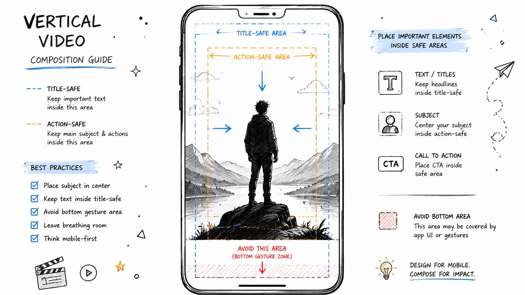
The first frame has to do real work. TikTok may not use a classic thumbnail grid the way YouTube does, but the opening image still decides whether the scroll stops or keeps moving. Strong contrast, a clear subject, and one readable emotional cue give the viewer a reason to stay for the next second.
A frame that works looks obvious fast. The eye should land on one point without hesitation. If the shot is busy, underlit, or built around tiny details, the preview loses force before the clip even starts.
Treat the opening frame like a promise
Use the opening frame to show the value of the clip right away. A surprised reaction, a product held close to camera, or a clean before-and-after setup can all work if the point reads instantly. The frame does not need to explain the whole video, it only needs to make the next beat feel worth watching.
For creators who also post to YouTube, preview discipline matters even more. Small images punish clutter, and text that looks fine on a desktop screen can disappear on mobile. That is why thumbnail best practices for creators keep pushing large visual elements and simple layouts, because the frame has to survive at a small size.
Match the frame to the clip type
A reaction video should look reactive. A tutorial should look easy to understand at a glance. A challenge clip should feel energetic. If the opening frame sends the wrong signal, viewers feel a slight mismatch and keep swiping.
The same rule applies to preview stills pulled from a longer edit. Choose the frame that carries the strongest question, payoff, or reaction, not just the cleanest-looking shot. When the preview tells the right story before playback starts, the edit earns a better chance to hold attention.
8. Visual Effects (VFX) & Transition Stacking
VFX should make the edit easier to follow, not harder. A clean zoom, a controlled blur, or a short motion accent can direct attention to the right beat, but once the effect starts calling attention to itself, the clip loses focus. The best stacks feel intentional, with each layer doing one job and then getting out of the way.
Stack effects only when each one has a job
A zoom can pull attention to a reaction. A fade can soften a cut between scenes. A color shift can mark a change in mood or time. Use them together only when they reinforce the same moment, because stacked effects that compete with each other make the edit feel crowded.
Restraint matters more than complexity. A repeatable transition style gives your videos a recognizable visual rhythm without turning the edit into a gimmick. That is also where motion blur and easing earn their place, since they make movement feel less mechanical and help cuts settle naturally into the next shot.
Let the transition support the punchline
Comedy edits usually land better when the effect underlines the joke instead of replacing it. A quick zoom can sharpen the punchline. A tiny shake can add pressure to a reveal. The effect should point the viewer at the moment that matters, not pull attention away from it.
Dance clips use motion and outfit swaps to keep energy high. Educational clips usually need lighter treatment, with arrows, highlights, and simple animated callouts doing the heavy lifting. Those choices work because they clarify the moment fast, which matters more than showing off the transition itself.
If a shot already carries tension, the safest move is often to leave it almost alone. A strong performance, a clean cut, or a well-timed audio hit does more than a stack of decorative layers ever will.
Keep the edit readable at phone size
A transition that looks good on a large monitor can feel messy on a phone. Fast overlays, particles, and repeated flashes can blur into visual noise once the clip is compressed and played in the feed. The fix is to test every effect at the size people watch in, then cut anything that hides the subject.
Creators who also care about packaging should keep thumbnail best practices for creators in mind, because the same rule applies before playback starts. Clear focal points beat crowded visuals. A viewer should understand the shot before the transition finishes.
Use VFX to finish, not to rescue
The cleanest workflow is simple. Cut for pacing first, sync the audio second, then add effects only where the clip needs a visual cue. That order keeps VFX in the support role, which is where they make the biggest difference.
The temptation to stack more layers usually shows up when the base edit is weak. Fix the timing, tighten the shot choice, and trim the dead space first. Once the skeleton is strong, the right transition can improve the polish without hiding the work underneath.
8. Visual Effects (VFX) & Transition Stacking
Subtle VFX can make a TikTok feel smoother and more polished, but heavy effects can just as easily bury the message. The best edits use motion, zoom, and small shifts to guide attention, then stop before the viewer notices the machinery. Too many layers turn into noise.
Stack effects only when each one has a job
A zoom can emphasize a reaction. A fade can soften a scene change. A color shift can signal mood. Combine them only when they work together, because too many effects fight each other and make the edit feel busy.
One useful rule is to keep each transition restrained and repeatable. That gives your videos a recognizable visual language without locking you into a gimmick. Motion blur and easing help too, because they make keyframes feel less mechanical.
Let the transition support the punchline
Comedy creators often get the most out of VFX when they use a zoom to underline the joke rather than replace it. Dance creators use movement and outfit swaps, while educational creators lean on arrows, highlights, and simple animated callouts. The effect should clarify the moment, not compete with it.
Use effects the way you'd use seasoning, enough to improve the dish, not enough to hide the ingredients.
If you want more polished motion work without building every asset from scratch, a service like motion graphics animation service can handle the parts that slow creators down most. That's especially useful when you need clean titles, animated callouts, or branded transitions across multiple clips.
For creators repurposing content, the thumbnail discussion also matters because a strong preview and a restrained effect package often work better together than an overloaded edit, which is why thumbnail best practices for creators is worth keeping in mind when you plan cross-platform assets.
8-Point TikTok Video Editing Tips Comparison
| Technique | 🔄 Implementation complexity | ⚡ Resource requirements | 📊 Expected outcomes | 💡 Ideal use cases | ⭐ Key advantages |
|---|---|---|---|---|---|
| Quick Cuts & Transitions for Pacing | Medium–High 🔄, precise timing needed | Moderate ⚡, editing time, audio sync | High 📊, increases retention (⭐⭐⭐⭐) | Short energetic clips: dance, comedy, fast tutorials | Boosts watch-time and polish |
| Text Overlays & On-Screen Graphics | Medium 🔄, timing + legibility checks | Low–Moderate ⚡, motion text tools, fonts | High 📊, improves comprehension & silent viewing (⭐⭐⭐⭐) | Educational, punchlines, muted-view audiences | Accessibility and message clarity |
| Sound Design & Music Sync | Medium 🔄, beat-matching and mixing | Moderate ⚡, audio assets, licensing, monitoring | Very High 📊, discoverability and emotional pull (⭐⭐⭐⭐⭐) | Dance, challenges, voiceover-led stories | Algorithmic promotion and memorability |
| Color Grading & Visual Consistency | Medium 🔄, color theory and LUT application | Low–Moderate ⚡, LUTs, calibrated monitors | Moderate–High 📊, stronger brand recognition (⭐⭐⭐) | Beauty, fashion, lifestyle, branded series | Cohesive visual identity |
| Trend Adaptation & Format Hooks | Medium 🔄, requires fast iteration | Low ⚡, rapid edits, trend monitoring | High but time-sensitive 📊, short-term reach spikes (⭐⭐⭐⭐) | Duets, POVs, challenges, viral formats | Rapid visibility and community relevance |
| Vertical Video Optimization & Safe Zones | Low–Medium 🔄, composition discipline | Low ⚡, safe-zone guides, device testing | Moderate–High 📊, fewer cropping errors; better UX (⭐⭐⭐) | All native TikTok content, mobile-first shoots | Prevents cut-off content; improves readability |
| Attention-Grabbing Thumbnails & Previews | Low–Medium 🔄, first-frame design | Low ⚡, frame selection, thumbnail export | High 📊, increases initial click/stop rate (⭐⭐⭐⭐) | Cross-posting, Reels, YouTube previews | Strong opening frames boost CTR/view-through |
| Visual Effects (VFX) & Transition Stacking | High 🔄, technical skill and restraint | High ⚡, render time, compositing tools | High when well-executed 📊, perceived production value (⭐⭐⭐⭐) | Brand content, high-production creators, stylized edits | Professional polish and emphasis on beats |
From DIY Edits to Professional Polish
These tiktok video editing tips work because they focus on the parts of the edit that control attention, not just the parts that look impressive. The creator who understands pacing, captions, audio sync, vertical framing, and clean preview design will usually outperform the creator who only uses more effects. That's the shift in TikTok editing, the job is to make comprehension immediate and replay feel natural.
The hard part is consistency. It's easy to make one strong edit when you're inspired, but much harder to keep that quality across a whole posting schedule. That's why templates, repeatable workflows, and clear export settings matter so much. They reduce decision fatigue and keep your videos visually aligned from post to post.
Sometimes the smartest move is to hand off the polish. If your team is already creating ideas, filming, and managing posting, outsourcing the edit can protect consistency without forcing you to slow down. A professional service can also help when you need branded motion graphics, cleanup, mix adjustments, and fast turnaround on short-form vertical work.
Your job is to keep the creative direction sharp. The edit can be your signature, but it doesn't have to consume your week. If you want a practical way to keep publishing without sacrificing quality, use AI editing and scheduling TikTok alongside a repeatable editing workflow, then bring in outside help when the workload starts to outrun your time.
If you're ready to turn rough clips into sharper TikToks, visit Your Video Editor to get professional short-form editing, motion graphics, captions, and platform-ready exports handled by a team that works with creators every day. They can help you keep pace, keep quality consistent, and free up more time for filming the next post.