Color grading is the post-production step where editors adjust contrast, color, and tone to give finished video a deliberate look and mood, typically after color correction. It's the part of the edit where flat footage stops looking like a camera file and starts feeling like a scene.
You've probably dragged a few sliders, exported, and then wondered why your video still looked a little dull compared with the creators you admire. That gap usually isn't about owning more presets, it's about understanding where grading fits in the workflow and what problem it solves.
Table of Contents
- What Color Grading Actually Means in Video Editing
- Color Grading vs Color Correction
- Inside the Professional Grading Pipeline
- Scopes, LUTs, and Nodes Explained
- Signature Looks and Real-World Use Cases
- Practical Tips for Cleaner Grades Every Time
- DIY Grading Versus Hiring a Professional Editor
- Mobile, HDR, and the Future of Color in Online Video
What Color Grading Actually Means in Video Editing
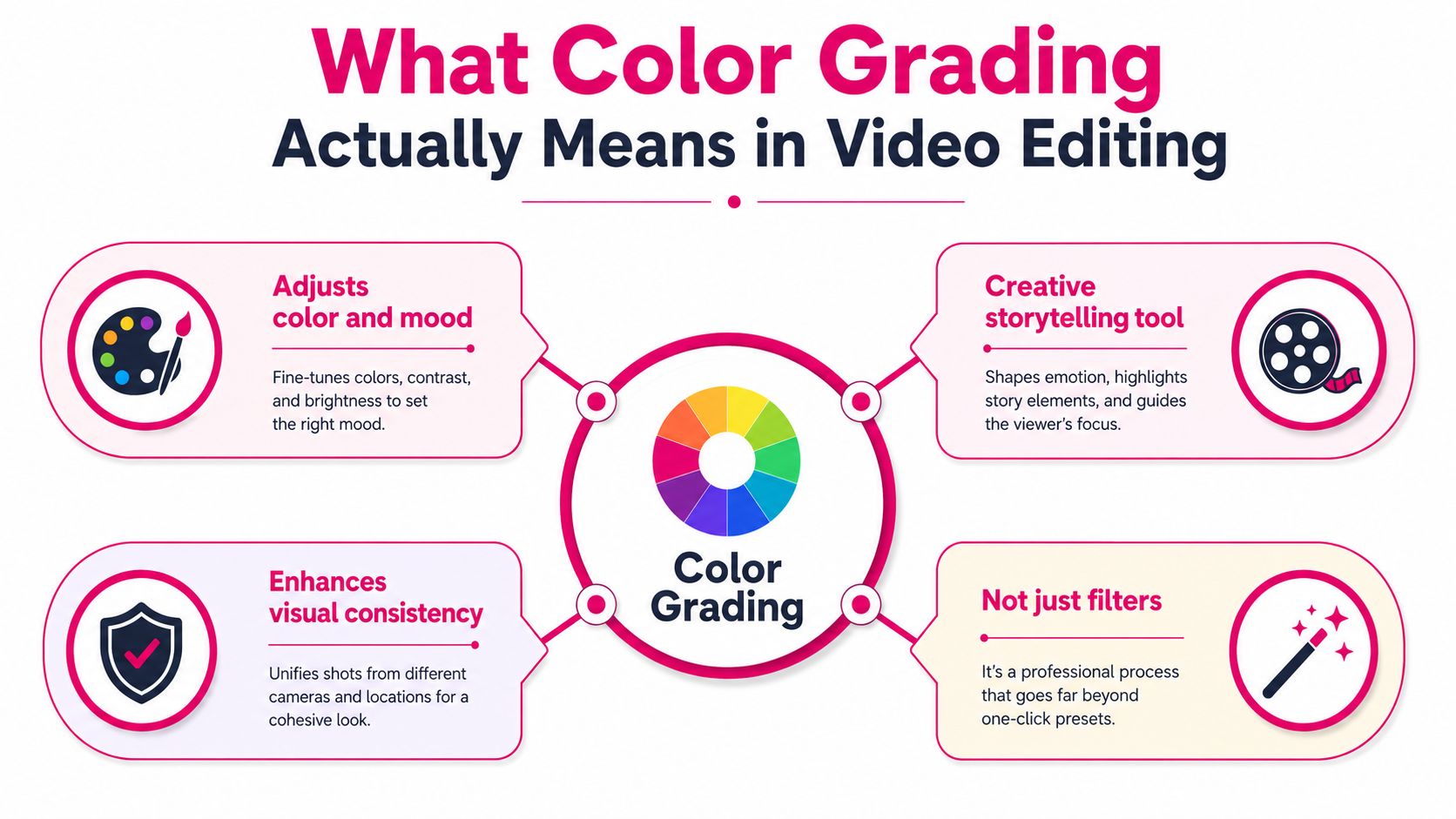
You cut a video, the pacing feels right, and then the images still don't match the mood in your head. That's the moment most new editors reach for a filter and hope it fixes everything. Color grading is the better answer, because it's the deliberate post-production step where you shape contrast, saturation, and tonal balance to create a specific look or feeling, and it comes after technical correction rather than instead of it [academic overview of post-production grading].
Grading is styling, not rescue
Think of grading as visual authorship. You are choosing whether the scene feels clean, gritty, nostalgic, tense, airy, or clinical. The grade doesn't just make footage “better,” it makes the footage say something.
That's why grading isn't the same as a camera setting or a one-click preset. A preset can nudge a clip toward a look, but it won't solve poor exposure, mixed lighting, or a color cast that came from the shoot. A grade also isn't a replacement for bad lighting. If the image was captured poorly, grading has less to work with and can expose the flaws instead of hiding them.
Practical rule: if the image already feels balanced and natural, grading can push it toward style. If the image feels technically off, fix that first.
Where it sits in the edit
A useful way to place grading is between the clean-up pass and the final export. Technical correction comes first, then grading shapes the emotional direction, then the file is prepared for the platform or display it'll live on. That order matters because grading works best when the image is already stable.
If you want to see how working editors think about the craft in practice, a helpful starting point is browse colour grading workflows. Read it as a workflow reference, not as a style rulebook.
The easiest way to explain grading to another editor is this. Color correction makes footage accurate. Color grading makes it intentional. Once you separate those two jobs, the rest of the process starts making sense.
Color Grading vs Color Correction
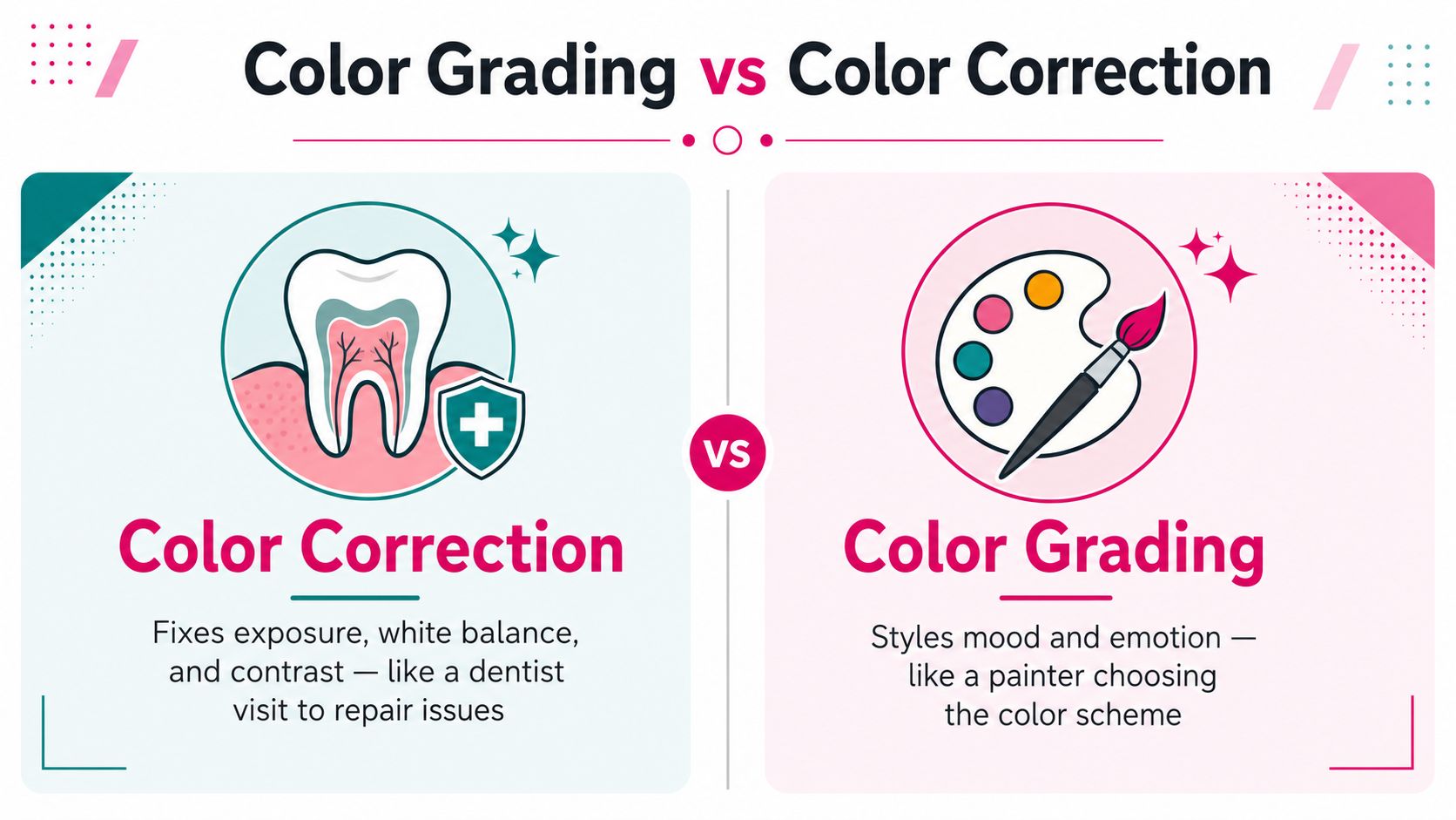
New editors mix these up because both happen in post and both use similar controls. The split is clearer once each pass has a separate job. Color correction fixes problems. Color grading creates personality.
Fixing the image versus shaping the image
Color correction is the repair pass. It evens out exposure, neutralizes white balance, and matches shots so one camera angle does not look bluer or greener than the next. If skin is too dark, if a white wall reads orange, or if two cuts feel like they came from different rooms, that belongs in correction.
Color grading comes after that. You choose the contrast curve, decide whether the blacks stay lifted or sink deeper, steer the palette toward warmth or coolness, and build the emotional tone of the piece. A documentary interview can stay truthful and still feel calm, serious, or intimate once the grade is in place.
The dentist and the wardrobe
Correction works like a dentist visit. It fixes what is broken. Grading works like wardrobe selection. It gives the footage personality. You would not ask a dentist to design an outfit, and you would not ask wardrobe to fix a chipped tooth.
That same logic helps with presets and LUTs. A LUT is usually a grading shortcut or a starting point, not a correction pass. If you drop a stylized LUT onto footage that has not been balanced, the problems stay visible underneath the look. The result often feels heavy-handed because the image never got neutralized first.
Quick check: if your question is “how do I make this clip look natural?”, you are probably in correction. If your question is “how do I make this clip feel cinematic, warm, cold, or branded?”, you are in grading.
A simple decision filter
Use this mental checklist on your own footage. It keeps the workflow clear, especially when you move between log footage, a working space, and the final delivery transform.
- Exposure looks off: correction first.
- White balance feels wrong: correction first.
- Shots do not match each other: correction first.
- The clip is already balanced but feels flat: grading time.
- You want a stylized palette or emotional tone: grading time.
If you want a fuller view of how editors organize that workflow, video editing workflow basics is a useful reference.
One pass makes the image behave. The other pass decides what the image feels like.
Inside the Professional Grading Pipeline
A real grading session is less like playing with sliders and more like walking through a sequence. If you skip the order, the grade starts to fall apart. The technical pipeline usually begins in a wide-gamut log working space such as ACEScg, DaVinci Wide Gamut, or a camera-native log profile, then moves through primary corrections, secondary corrections, and ends with an output transform to Rec.709, DCI-P3, or HDR standards [technical grading pipeline overview].
Why the working space comes first
Log and linear working spaces preserve more of the source image's dynamic range. That matters because later changes to contrast, saturation, and hue have more room to breathe without clipping highlights or crushing shadows. If you try to do everything in a narrow, display-ready space too early, the image gets boxed in fast.
The pipeline also gives you control over the right kind of task at the right time. Primary corrections handle the broad fix. Secondary corrections handle isolated areas like skin, skies, or backgrounds. Tools like HSL qualifiers and power windows let you affect part of the frame without changing the whole frame.
Creative moves happen after the base is stable
Once the image is normalized, you can start pushing the look. That's the point where creative contrast, hue shifts, and saturation design make sense. If the base image is still uneven, the creative layer just magnifies the problems.
The final step is the output transform. This is the part many beginners overlook, and it's where a grade either lands correctly on the target display or falls apart. A grade that looks strong in the grading suite can still look wrong if the color space conversion is off, because the display transform is what makes the image render consistently for the final device.
Here's the order a working colorist protects:
- Start in the working space so the image keeps its range.
- Balance the whole frame with primary correction.
- Target specific areas with secondary tools.
- Apply the output transform for the final delivery format.
If you want a broader look at how editors organize the edit-to-finish process, the workflow outline at https://yourvideoeditor.com/video-editing-workflow/ is a useful companion reference.
The essential lesson is that grading is not one action. It's a chain of decisions, and the order is what keeps the chain clean.
Scopes, LUTs, and Nodes Explained
The first time you open a grading panel, it can feel like you need to understand twenty tools at once. You don't. Start with the tools that tell you what the picture is doing before you decide how you want it to look. That means scopes, LUTs, and nodes or layers.
What the scopes are actually showing
A waveform monitor shows luminance levels across the frame. It helps you see whether the image is too low, too high, or uneven from shot to shot. A vectorscope shows hue and saturation, which is why it's so useful for checking skin tone and spotting color casts before they become obvious on playback.
The biggest beginner mistake is grading by eye alone. Your monitor, the room light, and your own visual adaptation can all fool you. Scopes don't replace taste, but they do keep your choices grounded.
If a shot looks fine to your eye but the waveform says the midtones are buried, trust the scope first.
Where LUTs help, and where they don't
A LUT is a lookup table, which is basically a pre-built mapping from one color state to another. In practice, that means it can be a fast way to preview a look or jump-start a creative direction. It is not a substitute for balancing the footage underneath it.
Beginners often use a LUT as a final answer, then wonder why skin looks odd or shadows feel muddy. The LUT didn't break the image. It just revealed that the image needed correction first.
For editors who work across different NLEs, the surrounding tool layout matters too. DaVinci Resolve is built around node-based thinking, while Premiere and Final Cut lean on adjustment layers and stack-based workflows. If you're comparing editing environments, the structure of the toolset matters as much as the buttons themselves, especially when you're choosing between Final Cut and Adobe Premiere Pro.
Why nodes and layers matter
Nodes and layers let you separate jobs. One node can handle exposure. Another can isolate skin. Another can hold a creative look. That separation gives you room to revise without breaking everything else.
A simple node graph or layer stack also makes troubleshooting easier. If something feels off, you can disable one stage at a time and see where the problem started. That's hard to do when all your decisions are buried in one giant correction.
The professional habit is simple. Read the scopes, correct the base, then build the look in layers. That order keeps you from guessing your way through the grade.
Signature Looks and Real-World Use Cases
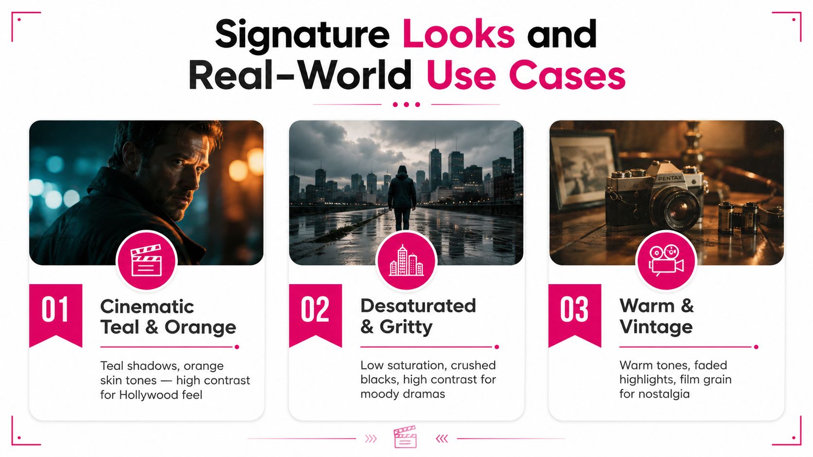
Different projects need different kinds of color decisions. A wedding highlight reel, a YouTube talking head, and a documentary interview can all be technically correct and still need very different grades. The point of grading isn't to force one house style on everything, it's to match the picture to the story.
Cinematic teal and orange
The classic cinematic look usually leans on a complementary split. Shadows drift toward teal, while skin and highlights stay warm and orange. You can build that with curves, color wheels, and sometimes a targeted HSL adjustment to protect faces while the background takes on the stylized push.
This look suits narrative film, trailers, and dramatic B-roll because it creates separation and energy. It tends to feel more produced than neutral color, which is why it shows up so often in content that wants a filmic identity.
Clean YouTube vlog
A vlog grade usually works best when the viewer forgets about the grade entirely. That means a gentle S-curve, neutral skin, controlled whites, and highlights that don't blow out the forehead or wall behind the speaker. The goal is clarity, not swagger.
Primary wheels, curves, and a small amount of selective cleanup are enough. If the footage already has decent lighting, a restrained grade will often look more expensive than a dramatic one.
Moody documentary
A documentary look often lives in desaturated midtones, deeper blacks, and a cooler base. It can feel observational, tense, or intimate depending on how far you push it. HSL qualifiers help if you want to protect a face, a sign, or a key object while the rest of the frame stays quieter.
That's why the same clip can go in three directions and still be “correct.” A talking-head shot can feel glossy for a brand channel, calm for a tutorial, or severe for a true-crime segment. The grade changes the story without changing the words.
Practical Tips for Cleaner Grades Every Time
Clean grades usually come from discipline, not from fancier plugins. The habits that matter are boring in the best way. They keep your choices repeatable and save you from fighting the image later.
Build the grade in the right order
Separate exposure correction from creative styling. If the image is underexposed, lifting it later can amplify noise and weaken color fidelity. If skin sits too low, faces can read muddy even when the rest of the frame looks fine. A published videography workflow recommends placing skin tones around 70% to 75% IRE on the waveform monitor and then shaping the image with curves or wheels into an S-curve [waveform-guided videography workflow].
That doesn't mean every shot must look identical. It means you're using the scope to keep faces in a range that usually reads naturally while still leaving highlight room to breathe.
Keep your viewing conditions stable
A grade is only as trustworthy as the screen you're using to judge it. Work on a monitor you trust, keep the room light consistent, and don't bounce between wildly different displays while making creative decisions. The more consistent your viewing environment is, the less you'll chase false problems.
Match the export to the delivery target
For standard web delivery, Rec.709 remains the practical SDR target. HDR needs a deliberate HDR pipeline, not a casual export choice. If you're exporting for the web, stay aware of the platform and the file's color management settings so you don't end up with a grade that looks fine in the suite and strange after upload.
- Fix exposure first: don't try to solve a dark image by over-saturating it.
- Place skin carefully: use the waveform, not just your eye.
- Use log or a wide-gamut working space: that gives the grade more room.
- Check the final transform: the output color space is part of the look.
The cleanest grades usually come from patience. Fix the base, protect the skin, and let the creative layer sit on top instead of carrying the whole job.
DIY Grading Versus Hiring a Professional Editor
Some creators absolutely should grade their own footage. Others should hand it off. The right answer depends on volume, consistency, turnaround pressure, and how many camera and lighting problems are hiding in the source material.
When DIY makes sense
If you're still learning, posting at a modest pace, or experimenting with style, doing the grade yourself is valuable. You get immediate feedback, and every mistake teaches you something about your camera, your lighting, and your taste. Single-camera talking heads also tend to be more manageable than mixed-camera interviews or narrative scenes with lots of lighting variation.
When a pro makes more sense
Once you need a repeated look across a channel, faster output, or clean handling of mixed sources, a professional editor becomes less of a luxury and more of a workflow decision. A good colorist or editor can keep your palette consistent, handle the platform delivery details, and save you from spending your own production time on trial and error.
If you want a concrete option to compare against your in-house process, Your Video Editor's color grading service is built around color correction and grading as part of a larger editing workflow. The service model includes per-video pricing, time-stamped feedback, and turnaround windows of 3 to 5 days for long-form and 24 to 72 hours for short-form projects, which makes it easier to judge against your own schedule and output needs.
The honest line is simple. If grading is slowing down publishing or making your channel look inconsistent, outsourcing can be the smarter creative choice.
Mobile, HDR, and the Future of Color in Online Video
Color grading used to feel like a desktop finishing problem. That's not the world creators work in now. A single grade has to survive phones, desktop browsers, platform transcodes, vertical feeds, and displays that don't all render color the same way.
The delivery problem matters as much as the look
General grading definitions talk about changing contrast, saturation, black level, and white balance for presentation on different devices, but the modern question is more practical. How do you keep skin from going too hot, shadows from collapsing, and bright colors from turning noisy when the same file passes through YouTube, Reels, and Shorts?
That's why color management settings, Rec.709 LUTs, and maximum-depth or maximum-quality exports keep showing up in creator workflows. The craft is moving toward controlled pipelines, not just attractive looks.
One habit that will age well
The best long-term habit is to own the working pipeline instead of chasing a single aesthetic. If you understand where the footage lives before the grade, how the grade is shaped, and what transform gets it to the viewer, you'll make steadier decisions as delivery formats change.
That matters more every year because the screen is no longer one screen. It's a stack of devices and platforms, each with its own quirks.
If you want your videos to look consistent across every upload, Your Video Editor can handle color correction and grading as part of a full post-production workflow. Visit Your Video Editor to see how their editors, timestamped feedback system, and platform-aware delivery can help you ship cleaner footage without getting stuck in the grade all week.