You've probably clicked on a video, seen a long logo sting, and felt your attention disappear before the person even got to the point. That's the problem with most intros, they still behave like title cards instead of retention tools. If you want people to keep watching, how to create video intros starts with a simple shift, design the opening for the viewer's patience first, then let the brand appear fast enough to be remembered.
Table of Contents
- The Modern Video Intro a Retention Tool Not a Title Card
- Planning Your Intro for Maximum Impact
- Choosing Your Animation and Design Toolkit
- Core Motion Design and Audio Principles
- Exporting and Optimizing for Different Platforms
- Common Mistakes and When to Hire an Editor
The Modern Video Intro a Retention Tool Not a Title Card
A bad intro usually fails in the same way. It asks for attention before it has earned any. Viewers came for the topic, the answer, the payoff, and if your opening delays that payoff, they leave before your actual content starts.
The modern intro has a narrower job than old-school branding packages. It should confirm the video is on the right topic, establish enough identity to feel familiar, and move on. That aligns with the broader shift toward front-loading value instead of spending the opening on slow logos and decorative animation, a pattern reflected in guidance that says the first 5 to 10 seconds are the most critical for attention, with 5 to 15 seconds often performing best overall, and educational videos sometimes stretching toward 20 seconds (TubeBuddy summary via ReelMind).
Practical rule: if the intro would still make sense with the logo removed, you're probably focusing on the right thing, the viewer's reason to stay.
Retention beats decoration
Think like an editor, not a graphic designer making a bumper. The opening has to pay rent by keeping the viewer in the video long enough to reach the main substance. That's why the strongest intros usually open with a question, a problem statement, a result preview, or a visual cue that matches the title and thumbnail promise.
This is especially important for feed-driven viewing, where people scroll fast and make instant decisions. Sprout Social's 2026 social video statistics report notes that 60% of TikTok users cite short-form video under 60 seconds as their most frequent interaction format, while only 19% of Instagram users favor long-form content over 60 seconds (Sprout Social). If your viewer is already conditioned to move quickly, your intro can't spend half its life warming up.
The best way to think about the opening is simple. The intro is not the beginning of the brand story, it's the first proof that the video is worth the click.
Planning Your Intro for Maximum Impact
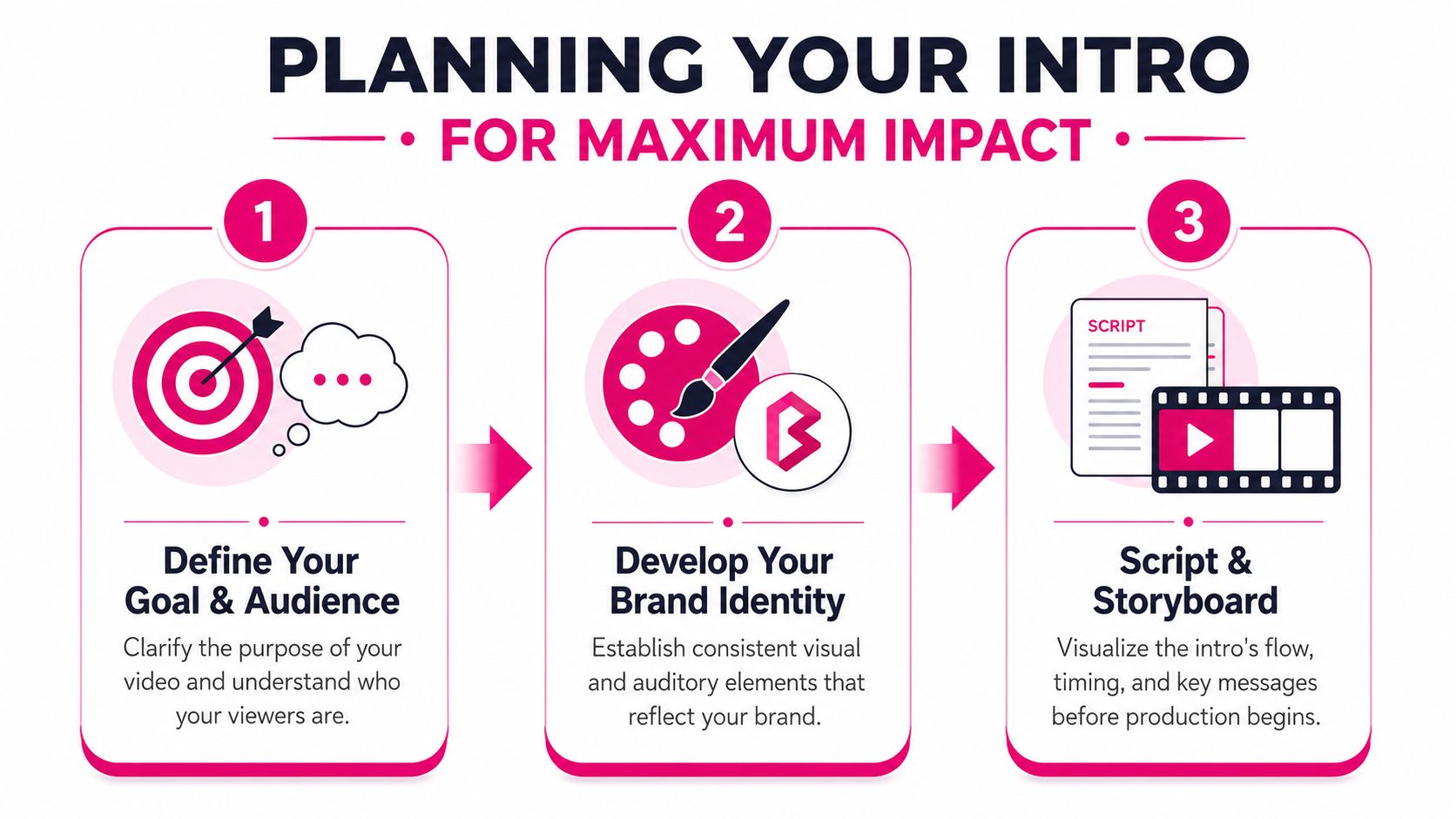
Good intros are written before they're animated. If you skip the planning step, you end up fixing timing, branding, and pacing inside the editor, which is the most expensive place to make strategic decisions. The cleanest workflow starts with a simple question, what must the viewer understand before the main content begins?
A practical blueprint has three parts, hook, brand identifier, and transition. The hook earns attention, the brand identifier makes the video feel yours, and the transition hands the viewer into the main content without friction. A useful reference point is the 3 to 5 second sweet spot many guides converge on, often with a teaser hook followed by a brand flash of no more than 1 second (Vibbit). That kind of timing forces discipline, which is exactly what most creators need.
Write the hook before you open software
Start by matching the title and thumbnail promise in a single sentence or visual idea. If the video is educational, the hook can point to a specific result or mistake. If it's a vlog, the hook can be a quick-cut moment that signals energy and personality. Either way, the viewer should know instantly why the next few seconds matter.
A good hook often comes from the same thinking used in script writing. If you're structuring the actual video around a clear viewer promise, it helps to map that promise first in this script-writing guide. The same logic applies to intros, the opening should not compete with the video's main promise, it should sharpen it.
For creators who want a faster brainstorming pass, a tool like Viral Hook Generator can help generate opening angles worth testing. Use it as a prompt, not a crutch. The primary goal remains: make the first moments precise enough that the viewer knows the video will deliver.
Build the intro around the video type
Different formats need different openings.
- Educational video: lead with the result, misconception, or surprising contrast.
- Vlog: use movement, faces, and a fast visual tease that signals momentum.
- Tutorial: show the problem first, then promise the fix.
- Podcast clip or interview: open with the strongest line, then move into branding.
The biggest mistake is treating every intro like a mini trailer. That approach looks polished, but it often drags the viewer away from the thing they clicked for. A branded intro only works when it helps the viewer orient quickly.
Choosing Your Animation and Design Toolkit
The right tool depends on how much control you need, how fast you need to publish, and how unique the intro has to feel. There isn't one best choice for everyone, because intro production is a trade-off between speed, customization, and learning curve. A template tool can get you to usable fast, while motion software gives you more room to build a signature look.
| Video Intro Tool Comparison | Best For | Cost | Learning Curve |
|---|---|---|---|
| Template makers like Canva or Placeit | Fast, good-enough intros for creators who need to publish quickly | Lower upfront cost | Easier |
| Professional software like Adobe After Effects and Premiere Pro | Highly customized branding and complex motion work | Higher investment | Steeper |
| Mobile editing apps | Quick turnaround for short-form content and on-the-go edits | Usually low | Easier to moderate |
If you just need a clean opening that won't break the rest of your workflow, templates are usually enough. If your channel identity depends on motion language, typography, and repeatable branding, After Effects is the more flexible path. The right answer is the one that matches the video's role in your workflow, not the one with the flashiest feature list.
Practical rule: don't buy more complexity than the intro needs. Most creators need consistency and clarity before they need advanced compositing.
For creators who want a finished look without building every motion asset from scratch, a managed option like motion graphics animation service is often a better use of time than learning a full effects stack from zero. That matters if the intro has to look polished across a lot of uploads, not just one flagship video.
Keep the tool choice tied to the outcome
A template maker is a smart choice when the intro needs to be “done” fast and the rest of the video matters more. Professional software makes sense when the intro itself is part of the channel's brand memory. Mobile apps are useful when the format is short, vertical, and designed for quick publishing.
Don't start with software. Start with the outcome you need. Then choose the least complicated tool that can reliably deliver that result.
Core Motion Design and Audio Principles
Great motion design feels expensive because it doesn't fight the viewer's eye. It moves cleanly, reveals information in order, and gets out of the way before the viewer grows tired. That's why the strongest intros usually feel simple, not crowded.
The most useful motion rule is to lock the runtime first, then design around it. Many guides converge on a 3 to 5 second sweet spot, often with a teaser hook followed by a brand flash of no more than 1 second, and some recommend micro-cuts of 0.5 to 1.5 seconds per frame to keep energy high (Vibbit). That tempo keeps the opening from feeling static without turning it into a noisy montage.
Make movement support the message
Easing matters because real movement doesn't start and stop like a machine. A slide that ramps in and settles naturally feels intentional, while a hard linear move can make even simple text feel cheap. Use fades, slides, and subtle scale changes to guide attention instead of throwing every effect at the screen at once.
Typography should behave the same way. Pick fonts that stay readable at small sizes, especially if the intro will be seen on phones, and keep the text short enough to scan instantly. If the title or tagline takes effort to read, the intro is already losing the retention battle.
A clean production workflow usually follows a simple sequence. Build the background, place the logo, animate the text, then check whether the composition is still clear when played at normal speed. That order keeps the design focused on recognition rather than decoration.
Treat audio as part of the animation
Music carries the pacing. A bright track can make a short intro feel energetic, while a muted bed can help the opening feel more editorial. Sound effects matter too, especially when used sparingly, because a small whoosh or click gives movement a tactile edge.
If you license music regularly, keep your process organized. A resource like music licensing for YouTube is useful because an intro is only professional if the audio side is legally clean as well as sonically balanced. Background music that's too loud can bury the voice or make the opening feel aggressive, while music that's too soft can make the intro seem unfinished.
A simple quality target helps here. Preview the intro with headphones and speakers, then again at a normal laptop volume. If the sound feels distracting instead of supportive, simplify it.
Watch the intro in motion, not frame by frame
The best test is playback, not stills. A design that looks elegant on a timeline can feel cluttered once it moves. Watch for small problems like text hanging too long, transitions that linger, or logos that enter with too much force.
Direct check: if the viewer's eye has to hunt for the logo, the motion is doing too much.
Exporting and Optimizing for Different Platforms
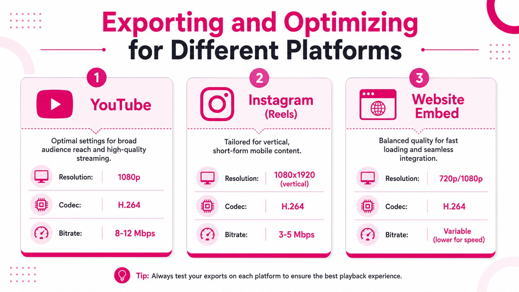
A strong intro can still underperform if it's exported for the wrong environment. The version that looks polished on YouTube may feel cramped on vertical platforms, and the one that works in a feed may lose its detail on a larger screen. That's why intro design should be treated as a system, not a single master file.
The platform gap matters most on short-form apps. A major weakness in generic intro advice is that it ignores how vertical formats, fast swiping, and low reading time change viewer behavior on TikTok and Reels, where traditional 5 to 10 second openers often miss the mark (vidIQ). An intro system has to adapt to both long-form and short-form workflows if you want to avoid rebuilding everything from scratch.
Match format to viewing context
For YouTube, a horizontal intro can carry a little more visual information because the viewer is already inside a longer watch session. For Reels or other mobile-first placements, the hook has to appear instantly and the composition has to stay legible in a vertical frame. That usually means fewer words, larger typography, and a tighter visual center.
The infographic above highlights the practical export split. YouTube favors 1080p with H.264 for broad compatibility, while vertical short-form content needs a 1080×1920 frame to fill the mobile screen cleanly. Website embeds usually benefit from a balanced file that loads smoothly without sacrificing basic clarity.
Build one intro system, then adapt it
The smartest approach is to create a core visual identity that can be resized into different versions. The motion can stay consistent, while the timing, framing, and text density change by platform. That saves editing time and keeps the brand recognizable without forcing every platform into the same shape.
A good export habit is to preview the final file in the same context where it will be watched. Check it in a phone frame for short-form, then on desktop for YouTube. If a logo or tagline feels too small in one place, adjust that version instead of assuming the same file will work everywhere.
Common Mistakes and When to Hire an Editor
The most common intro mistakes are easy to spot and easy to fix once you know what to look for. The trouble is that many creators don't notice them until the video is already public. That's why the final pass matters as much as the design work.
What not to do
- Don't let the intro run too long: viewers came for the content, not for a slow runway.
- Don't drown the opening in music or effects: if the sound is too loud or too soft, the intro feels amateur and harder to trust.
- Don't use text that's hard to read: illegible branding defeats the purpose of branding.
- Don't stack too many animated elements: cluttered motion makes the viewer work too hard to understand the opening.
Technical quality control helps here. A solid review process means previewing the intro multiple times to catch those failure points before release, and exporting at 1080p or higher so branding assets don't look soft or smeared (Project Aeon). That single habit catches a lot of avoidable problems before they reach an audience.
When the process starts eating time, bring in an editor. Not because editing is glamorous, but because the intro has to serve retention, brand consistency, and platform fit at the same time. A skilled editor can handle the motion details, audio balance, and export versions while you stay focused on the part only you can make, the actual content.
A CTA for Your Video Editor.